Conversion rate optimisation (CRO) is the technique of increasing the number of visitors that take a desired or profitable action on your website. It’s all very well attracting a decent amount of traffic to your website (inbound marketing for the win!), but if they are not doing what you want them to do when they hit your pages, they are not converting.
Whatever you are trying to achieve with your website, measuring the conversion rate (usually a %) is essential to gauge the number of website visitors that complete specific goals. If you are new to CRO, use this article to kick off your website’s strategy, and for the more experienced marketers, consider this your CRO health check.
One: Million-dollar question, what are you optimising your website for?
Before you ask the internet how to optimise your website for conversion (believe me, I’ve been there), step away from the keyboard and ask yourself (your team, your customers, and your Nan*): what is it you want people to do on your website? Identify a goal for each of your key pages in the form of what action you want visitors to take.
Don’t just think about the big goals. A conversion is not necessarily a product or service purchase, but all those other goals along the way that trigger a relationship that can be nurtured between you and your customers.
*Don’t ask your Nan.
Here are some examples of calls to action aimed at conversion:
- Product purchase – “Buy Now”
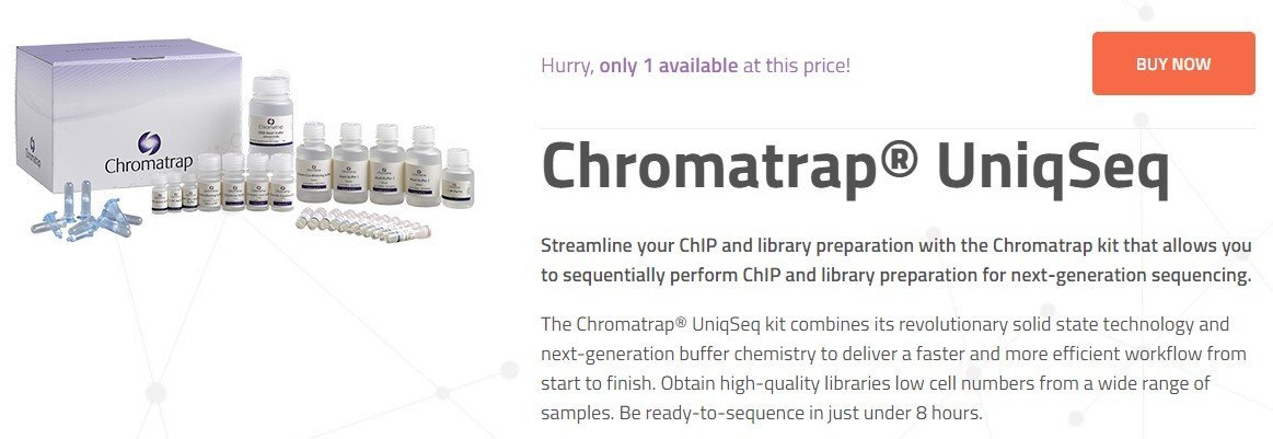
Source: Chromotrap
- Newsletter sign-up

Source: Thomas Lloyd
- Phone call (on mobile, visitors can click the icon and phone number to call Spindogs)
Source: Spindogs
- Trial sign-up / Open an account

Source: Hubspot
- Form or survey completion e.g. lead generation
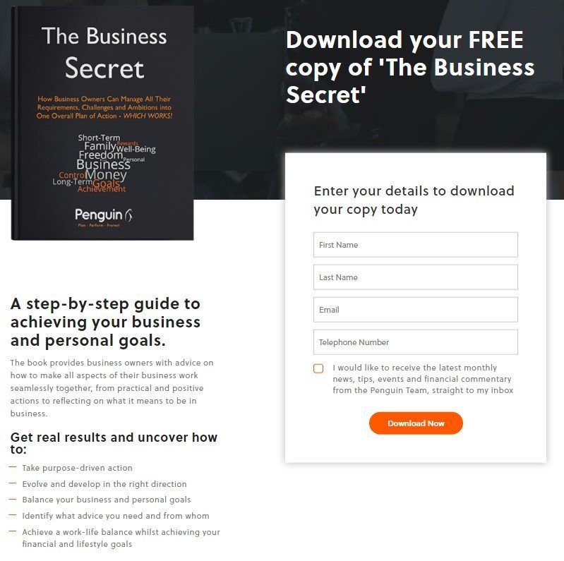
Source: Penguin Wealth
- Brochure request

Source: Thomas Lloyd
Two: It’s about the journey and the destination
The highest converting websites are designed with your audiences’ journeys in mind. Grab a pen and paper, and map out the series of steps, page-by-page, that enable visitors to achieve their goals as quickly and easily as possible on your website.
Getting really fancy, segment (aka break down) your audiences and figure out what you want each of these groups to do on your website, how you can help them complete their tasks, and any frustrating barriers you can remove along the way.
Don’t forget to follow through with the journey. It’s usually the money pages that get all the attention and look banging, but what about your confirmation or thank you page, where the visitor is led to after they’ve taken an action?
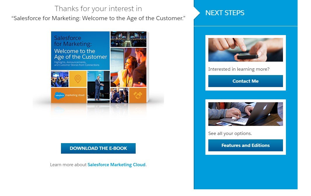
Salesforce do a good job of their thank you page with the killer combination of a strong call to action to download, engaging imagery, and links to related blog posts which demonstrate that they’ve put thought into what the visitor might want to do next.
Cross pollination is a key tool to increase conversion across your website. Whilst a visitor to your landing page shouldn’t have to think twice about where to go next, it’s important to link to other content that will assist them in their journey. A well-placed call to action to read a customer success story or download a white paper could prove vital to visitors who are still in the research stage and getting to know you.
For example, readers of Imperial College Business School’s blog are signposted to information about their programmes featured in the article:

Source: Imperial College Business School
Three: Test, optimise, test, optimise… rinse & repeat
A/B testing tools, such as the one from Google Optimize and heatmapping services (e.g. Mouseflow or CrazyEgg) are essential to examine what motivates your audiences to take profitable action and what doesn’t.
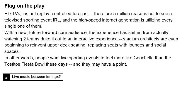
If your website isn’t encouraging visitors to take the desired action, then examine their user journey and look for opportunities to make the signposting more obvious. Experiment with different CTAs by switching up their location or their wording. Calls to action don’t have to be short to be punchy, as The Hustle’s emails consistently demonstrate:
You can also experiment with landing page layouts and strategically play around with the use of imagery and video to uncover golden nuggets of insight. Your current use of images, for example, could be excluding a key segment of your audience. Think, if you were in their shoes, would you see yourself reflected in the website’s content?
Because we practice what we preach, here’s a call to action
Whether it’s a website re-design, a specific section of the website that needs some conversion love (e.g. membership sign-up or e-commerce pages), or one or two money pages, our expert Online Marketing team can give bespoke advice on optimising your website for conversion. Fill out the form below or give us a call and we’ll be happy to talk to you.