A call to action (CTA), put simply, is you telling your potential customer exactly what you want them to do next.
It’s easy to pour your efforts into developing a carefully crafted email, video campaign, social post or blog entry only to miss your opportunity to get across precisely what the next steps are. But it’s also not always as simple as putting your CTA in capital letters where people can see it, sometimes, you need to dress it up a little.
Read on for our five top tips on creating a CTA that gets results.
Be clear!
It’s all well and good ensuring that you remember to include a call to action, but arguably the most important bit is getting your message right… there’s no point in slapping something bold and obvious across your beautiful campaign unless it’s crystal clear and strikes a chord with the reader/listener/viewer.
In line with this, try not to mix and match. Each CTA you add will dilute the last one, I know you’d love them to buy your products, sign up to your mailing list AND tag you in their next social post, but sticking to one clear action will give you a much higher chance of success.
Inject some emotion
Create something that’s relatable and makes your audience FEEL something. Whether it be a sense of how much taking the desired action will improve their lives, a play on FOMO (fear of missing out) or simply let them know that they’re in for a bargain if they take the next steps, don’t miss it.
Being on the same page and relatable to your customers shows that you know, understand and even care for them, and people respond very well to being known, understood and cared for, often FAR more than a traditional hard sell.
But why?!
Remember being told to do something when you were little and responding with your favourite words ‘but whyyyyyyy?’? I know that personally, I was a lot more likely to heed my mother’s words if I understood exactly why I should respond to her request.
You might think that the emotion you drew out of them in the first instance is enough, but just to make sure everyone’s on the same page and not missing another chance to be CLEAR, tell them why.
Add a deadline
You’ve made it this far, you’ve got a clear, concise, emotion-evoking CTA that explains the what’s, where’s and why’s but is there anything in place to stop the visitor thinking;
‘Hmm, looks good, I’ll pop back and buy that on my lunch break’…
Only to realise they’ve forgotten their lunch, head out to the shops and completely forget about you and your business?
In short, no.
Adding a deadline not only creates a sense of urgency, but also gives a clear indication that the action should be taken now, today, right this second.
Example:
“Buy X product because you need it!” vs “Buy X product today so you’re not without it tomorrow.”
Placement
Last but by no means least, where are you putting this thing?!
Putting your CTA at the end only works if you can guarantee that most people will make it that far, and that’s no easy task if your campaign is something more long-form.
Equally, putting it right at the beginning wouldn’t make a whole lot of sense without the rest of the messaging, so although you’re getting your point across immediately, you’re risking being lost in translation.
Unfortunately, there’s no right answer for this one as each campaign will differ but view it through the eyes of your potential customer and try to experience the journey as they would. If you’re too attached to it, hand it to a couple of colleagues or friends who haven’t seen it yet and be open minded, just because you’ve curated it doesn’t mean you’ll always know what’s best.
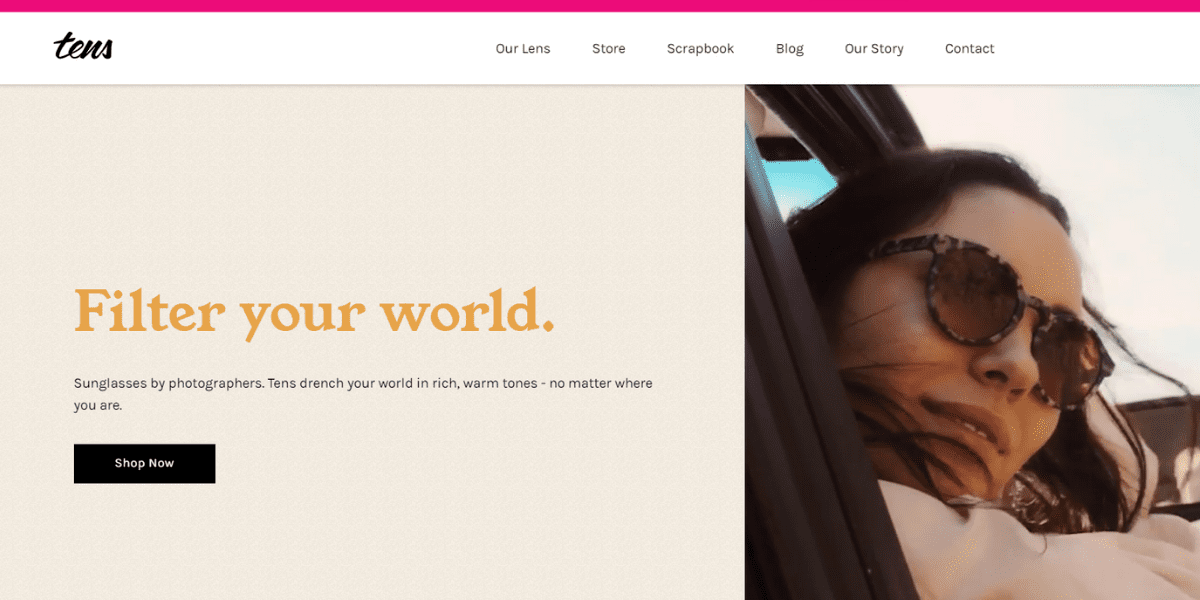
Let’s take a look at an example from Tens and see if it fits the five golden rules…

Clarity
Not only does the copy read “sunglasses” but the wildly attractive models prancing about in the sun-kissed desert all have one thing in common, they’re wearing tens sunglasses. I’d say it’s pretty clear what these guys are selling.
Emotion
The imagery used in the vintage looking video that plays alongside the CTA creates immediate nostalgia for a trip you’ve never even been on… Are you thinking that if you only owned a pair of these exquisite shades, your life might be a little more Instagram? Because, same.
Why?
It’s clear that these glasses are being marketed as a cut above the rest, they’re sunglasses by photographers and who on earth doesn’t want to be drenched in rich warm tones 24/7? That’s why.
Deadline
Shop now… not later, not tomorrow, not sometime down the line, now.
Placement
In this short-form, digestible and quick to read CTA the action button being at the end of the text but NEXT to the video works perfectly. You’re not required to sit through the whole thing to find your action point, it’s right there and if the video sells you the dream in the meantime then it’s win-win!
If you’d like to speak us about creating campaigns with impact, get in touch… today!