Heading back to the classroom
While a new logo and supporting collateral are often the exciting visual representation of a brand project, it’s crucial that they are underpinned by a strong and defensible brand position, otherwise your go-to-market can lack depth or appear inauthentic.
Undertaking a comprehensive Brand Discovery is the first step to gaining a deeper understanding of our clients’ brands, and the Call of the Wild project was no different. Through collaborative workshops with members from across the Call of the Wild and Spindogs teams we interrogated the organisation aiming to uncover insight into their services and USPs, their audiences, and values as an organisation and as individual leaders.
While the Brand Discovery identified clearly defensible values and voice, Call of the Wild’s service offering and consequently their organisational purpose provided a more unusual challenge.
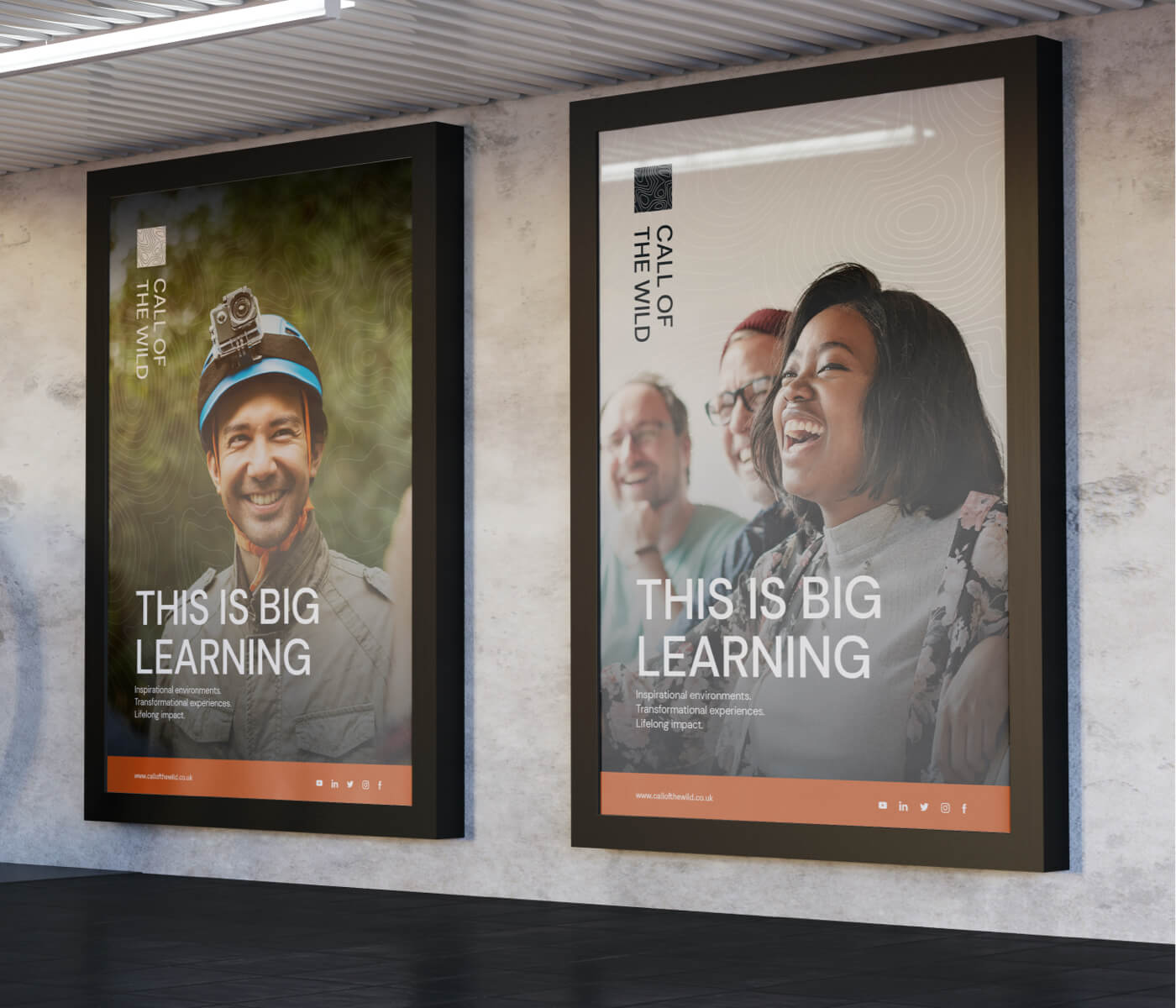
Concentrating on the experience of ‘learning’ and avoiding the terms ‘training’ and ‘outdoors’, we proposed ‘Big Learning’ as a go-to-market solution. By enabling Call of the Wild to own their uniqueness, ‘Big Learning’ breaks down the barriers of location – all environments can be inspirational – and places the focus on the outcomes and the journey towards achieving them.
Identifying ‘Big Learning’ as the means of communicating Call of the Wild’s unique approach enabled to unlock the brand as a whole. Previously identified brand values and tone of voice took on greater meaning as a result of better articulation, and a clear and compelling client commitment was developed alongside a resonant brand purpose. ‘Empowering growth by creating inspirational learning environments’ would become a reason for being that spanned everyone in the organisation from top to bottom and reinforced their already exhibiting behaviours as part of a greater whole.
The concept of Big Learning along with articulation and direction for the brand in action (values, purpose, client commitment, tone of voice) were compiled in a Brand Blueprint, which will enable Call of the Wild to inform their brand successfully into the future.


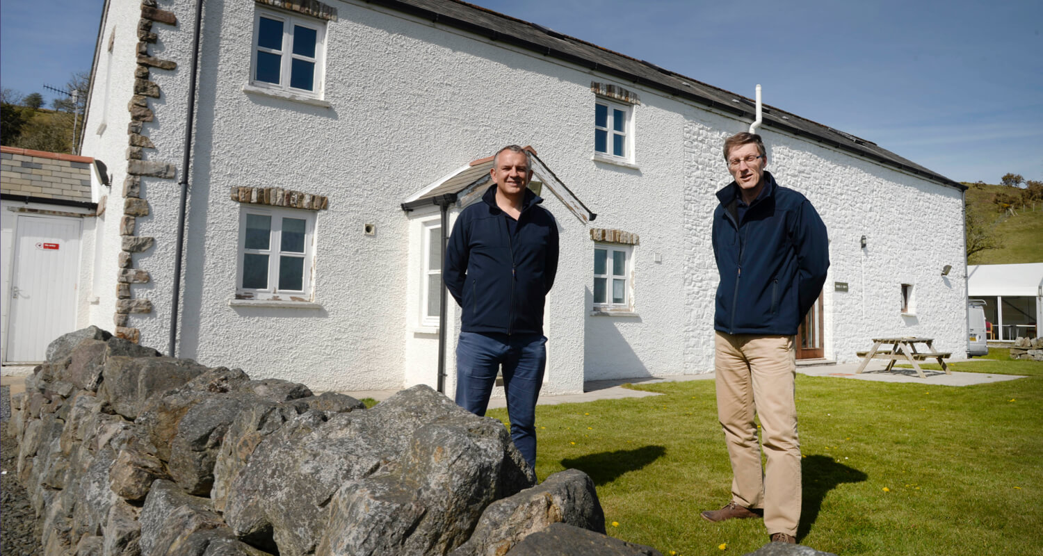
Celebrating 25 years in business, we wanted a new visual brand that will take us into the next phase of operation with confidence and maturity. We really enjoyed the brand discovery phase with Spindogs and felt they really understood our DNA through the process. What they've delivered has neatly brought together the elements of our offering, matching our vision for the future with a nod to our history, and provided us with a clean, modern brand that will grow with us.
Showcasing authentic moments
Ultimately, ‘Big Learning’ gave us the confidence and direction to deliver an exciting and authentic visual identity and enable the rebrand to capture the essence of its dual nature without being confined to a specific theme or aesthetic.
Drawing inspiration from industries that effortlessly blend urban and natural elements, such as outdoor clothing brands like Columbia and North Face, we sought to create a cohesive brand identity that resonated with their audience.
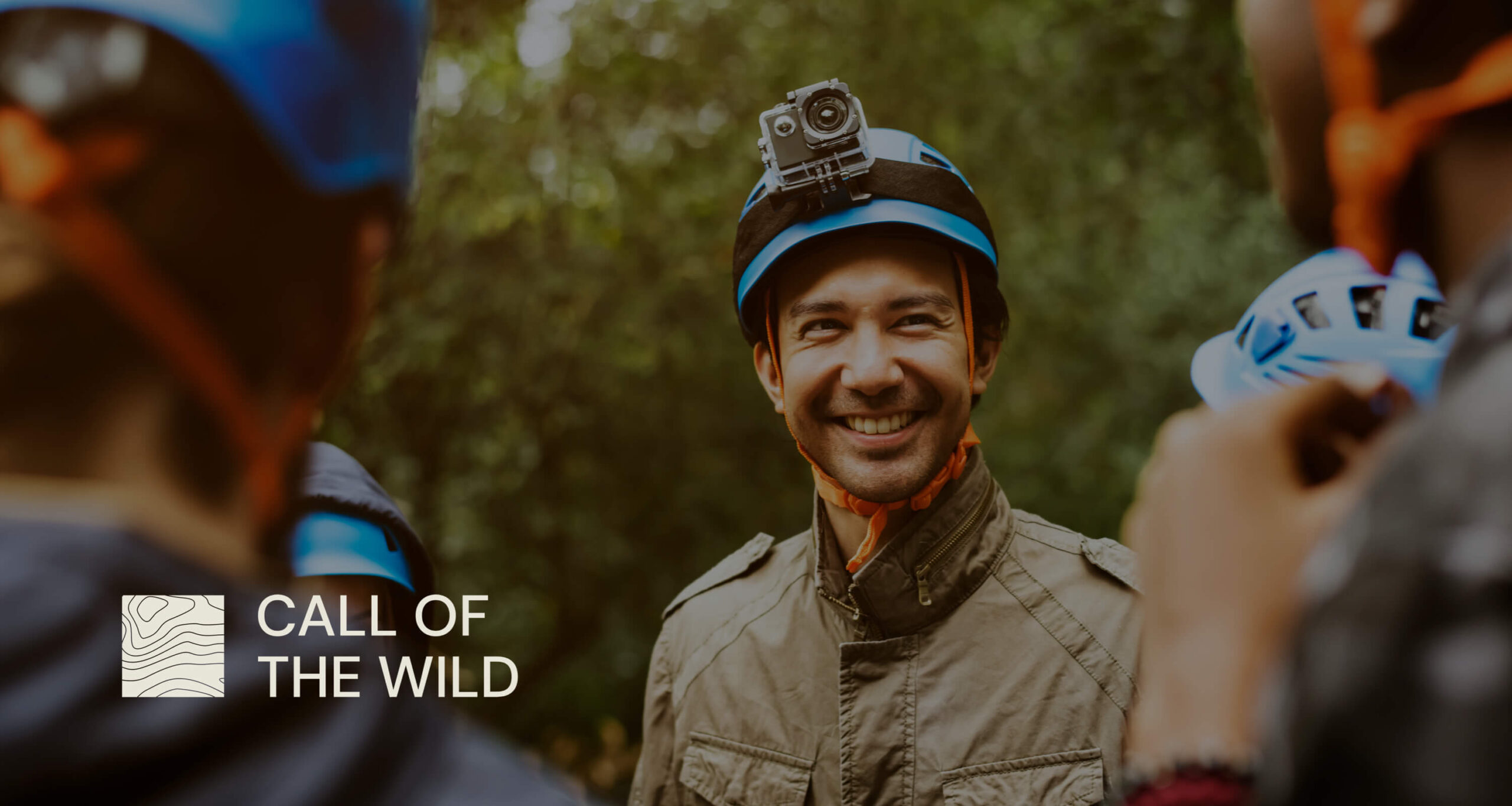
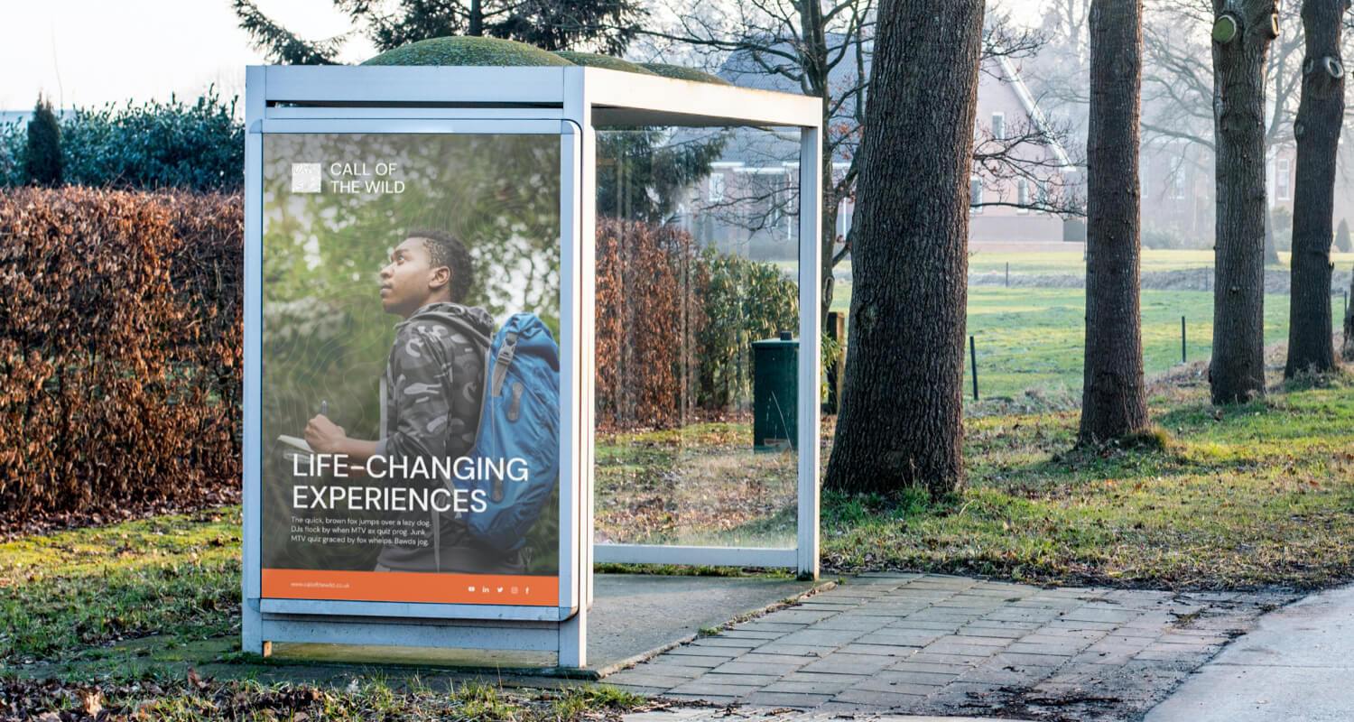
One of the key areas for evolution identified was photography. Recognising that visual storytelling was vital for showcasing their story, we aimed to capture the spirit of their services across various environments, seamlessly transitioning from the street to mountain landscapes. To achieve this, we curated a collection of photography that exemplified the desired approach – engaging learning environments, genuine and candid interactions between people, and the positive impact of their Call of the Wild experience. By moving away from staged, posed images, we could showcase authentic moments, conveying a sense of active participation, even if the individuals weren’t always smiling or laughing. In the outdoor imagery, we aimed to capture the essence of teamwork and collaboration, often hinting at a group effort through the portrayal of a single person. The focus was on selecting imagery that portrayed a more genuine, and diverse representation of their experiences and audience.


Embracing nature: paying homage to the Red Kite
For 25 years, Call of the Wild had built their reputation using a logo featuring the red kite – a symbol synonymous with their brand and the surrounding location. While this icon had played a pivotal role in the company’s success, it also posed some challenges. The strong association with the red kite often led to misconceptions about what the company did. However, it also provided a recognisable visual focal point for the team, and clearly carried significant emotional attachment. We recognised the need to evolve Call of the Wild’s identity but didn’t want to compromise such a huge part of their story.
Colour plays a significant role in the branding process. We recognised the importance of selecting a new colour palette that resonated with their brand values and conveyed a sense of harmony and consistency between the outdoors and business aspects of their offerings. Colour offered us a connection to heritage while enabling forward progression.
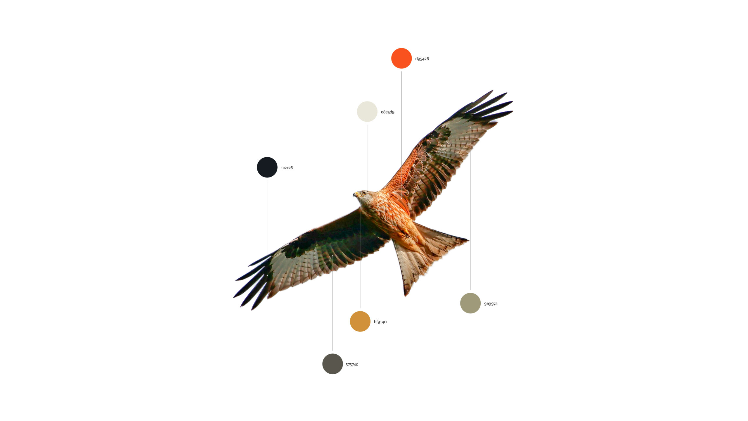
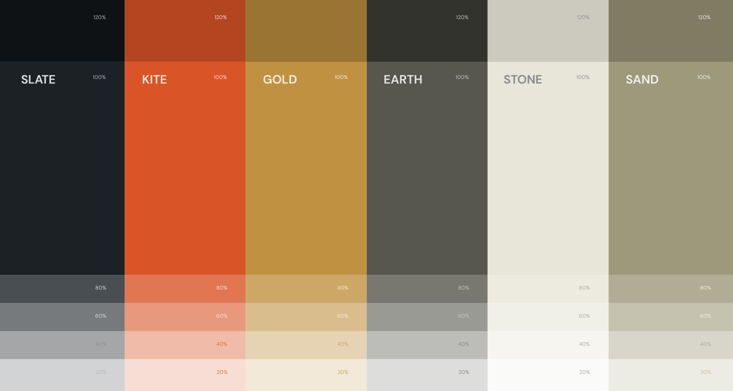
Looking to the red kite for inspiration, we used an image of the bird and extracted its colours of natural, earth tones to shape what was to be the chosen colour palette that formed the foundation of their rebranding efforts. The bright red on the original brand made way for slate, sand, hearthstone, patent, and gold – adding sophistication and flexibility to their visual identity. Mixing and blending these colours also allowed us to produce a broad suite of shades and tints, allowing for seamless integration across their various brand assets.
Empowering use of the brand across every touchpoint
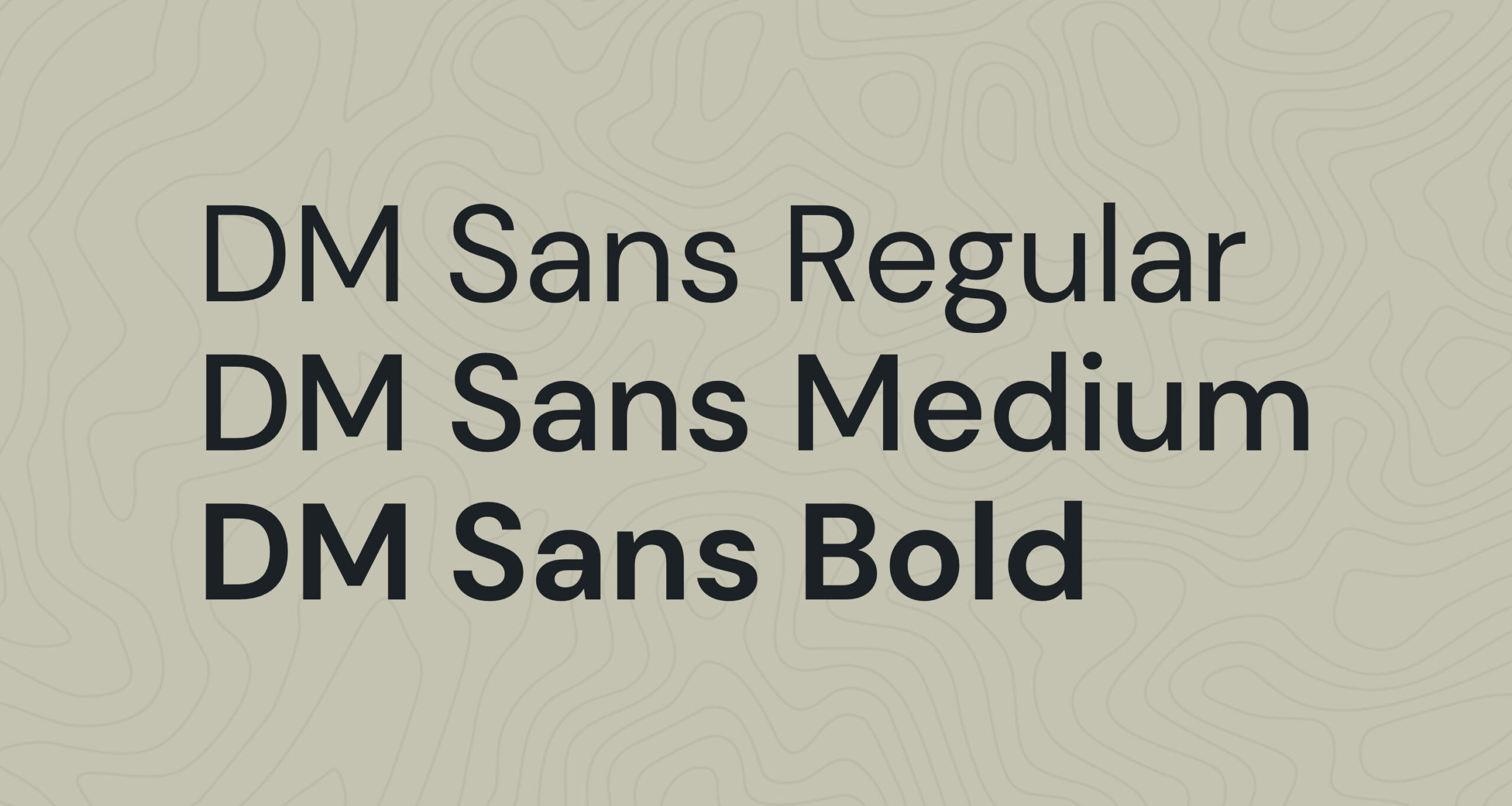
Upon reviewing the assets that already existed, we quickly identified typography as a key area for consideration. Our goal became to simplify their typography and provide a typeface selection that was easily recognisable.
We streamlined their typeface selection to just one, ensuring uniformity throughout the brand. In addition, we introduced hierarchy guidelines to empower Call of the Wild in their future application of the brand, allowing them to control the way users perceive and read their content and to ensure consistency across all touchpoints. We have found empowerment is key to the success of a business ensuring consistency in the roll out of any significant brand update.

Thinking inside the box
As with any brand project, the logo was a huge focal point of the rebranding process. While respecting the company’s legacy, we wanted to address its visual shortcomings, and reflect Call of the Wild’s growth and brand maturity.
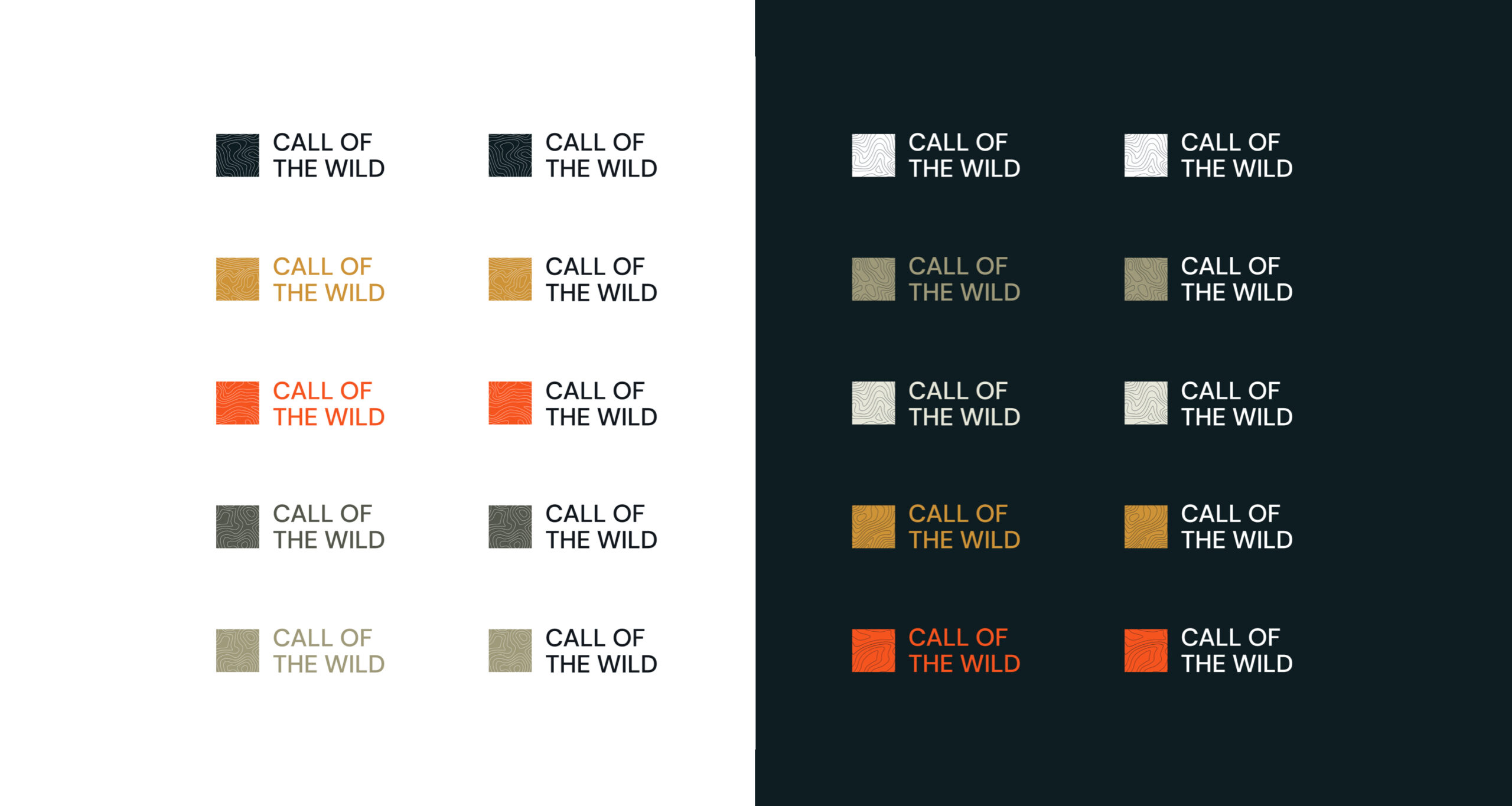
The previous logo had spacing issues and visual irregularities due to the sentence-like name and conjunctive words. To rectify this, we reimagined the logo by compacting the text to a uniform height and positioning the icon to the left. By employing the same height for all elements, we achieved a more balanced and cohesive visual identity.
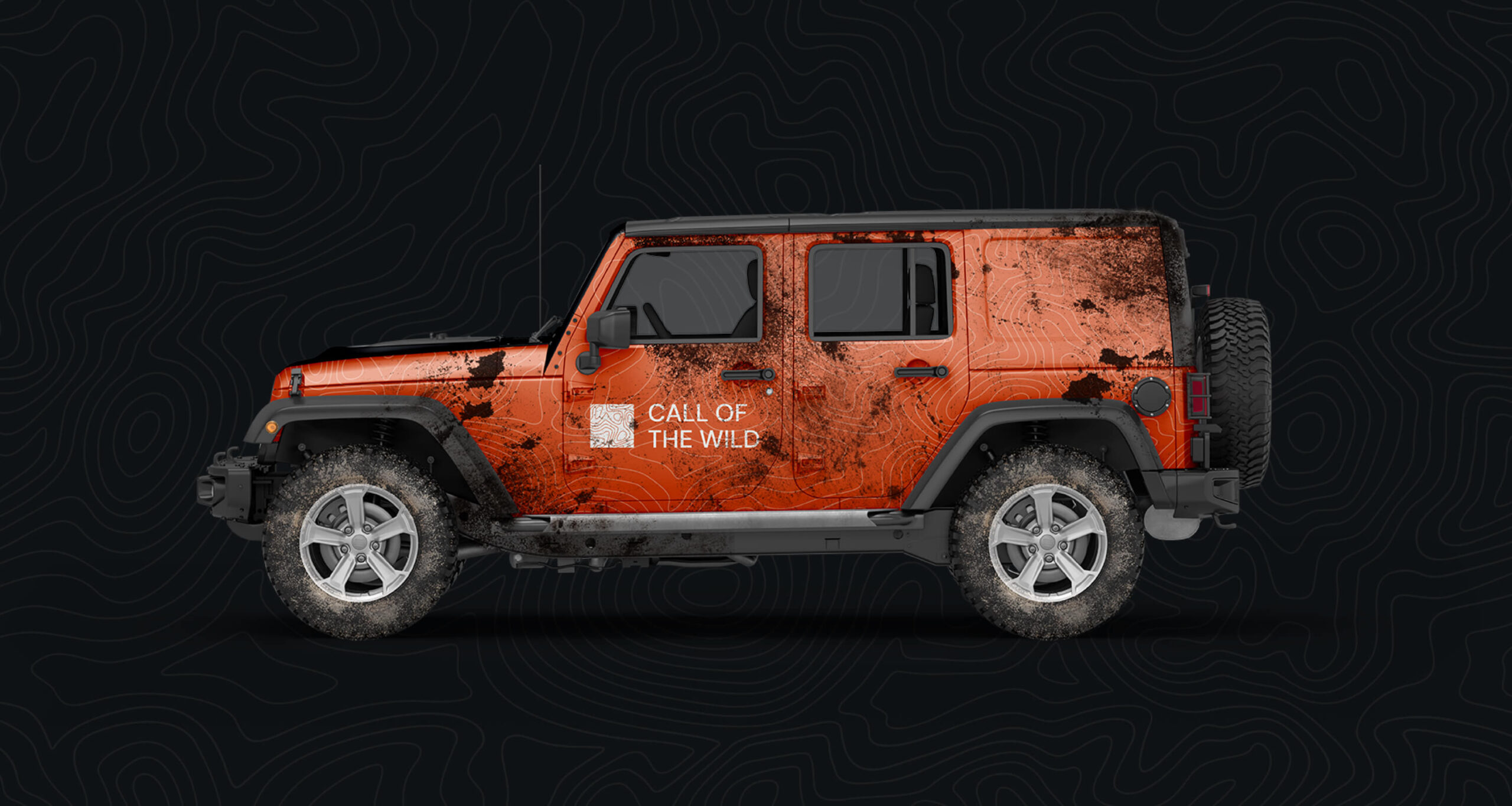
When designing the logo, we took into account Call of the Wild’s unique proposition and instead of following the conventional challenge of ‘thinking outside the box’, we chose to think inside the box, literally. We based Call of the Wild’s brand concept around a box to signify the company’s adaptability in any environment and drew inspiration from topographical maps and using the point of view of a red kite. As a company operating in the outdoors and Bannau Brycheiniog, Call of the Wild are extremely familiar with maps and this represents the expertise that they bring to their client’s organisations. By dividing the topography maps into squares, and blending them with abstract patterns, we developed a unique logo with ever-changing iterations. They say a logo should be able to be drawn by anyone, and this is true for Call of the Wild – this unique logo provides a recognisable symbol of Call of the Wild’s identity.
To further enhance the logo, we created a dynamic element that can be used in a digital format – a constantly evolving and morphing logo, showcasing the company’s adaptability and ever-changing nature. This animated logo will never be the same twice – but will still feel like Call of the Wild, just like no two of their development sessions are never the same.

I am delighted with the branding project we completed for Call of the Wild. The client has an outstanding product and all the potential for a striking brand. As a design team, this gave us a great opportunity to showcase their capabilities and expertise in creative and innovative ways. We were able to bring the company's personality to life, which was a real pleasure. Working closely with a brave and trusting client always produces the best results, and seeing them run with the brand is really gratifying and always the true end goal for an identity project.
Outdoors, on-site, online
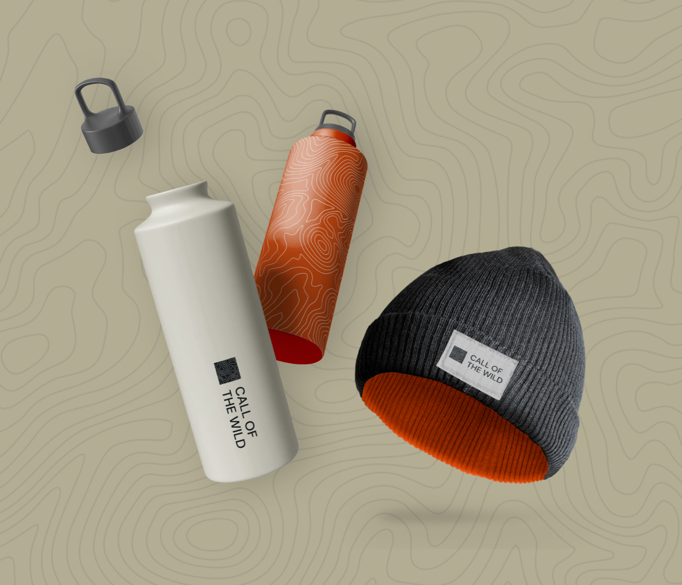
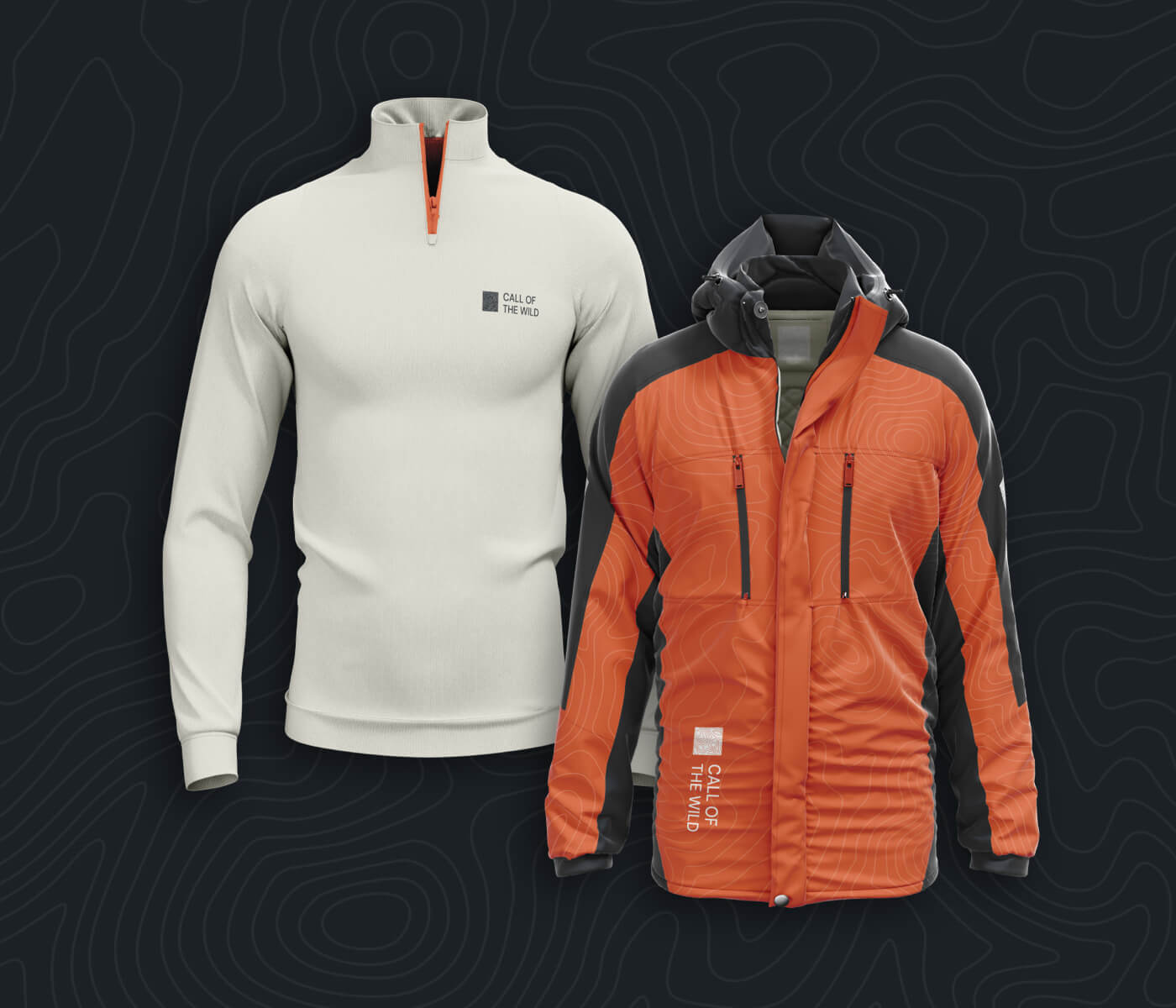
We know that a successful brand should be effortlessly adaptable, whether it’s on the side of a building or as compact as an app icon. We carefully designed the brand to make sure it could seamlessly transition across different touchpoints for Call of the Wild. From merchandise such as umbrellas and water bottles, to uniforms for their outdoor instructors we considered every detail. Not only would this enhance their visual identity, but also ensured their instructors could stand out for safety purposes, especially against natural backdrops.
By incorporating the ‘Big Learning’ concept into visual elements, such as clean lines juxtaposed against organic patterns, we could convey the fusion of outdoor adventure and corporate professionalism.
Documentation and data visualisation received a facelift too, with the new brand elements seamlessly blending to create visually appealing and coherent materials that makes the brand feel like the huge outfit that they are.

The adventure continues
By articulating a challenging proposition to better engage with their audience and reimagining their visual brand, Call of the Wild are now well placed to successfully showcase their quality and unique ability to deliver leadership and development outcomes. The cohesive visual identity not only reinforces their future growth plans, but pays homage to the journey they have been on, and signals the exciting adventure that still lies ahead for the Call of the Wild brand.
