The Brief
The Checks Direct brand was born out of a need to reinvent the checks business side of the company. The focus for New Directions – the business’s parent company – was on digital transformation, and as part of the strategy, the company wanted to invest in the development of Online DBS.
One of the main objectives of the project was to develop a brand that would position the company as the number one place to go for online DBS checks – their portfolio of services had long outgrown the name. As a key competitor in the DBS checks industry, the team wanted to strengthen their position in the market and develop a clear and concise brand that was fit for growth while also taking advantage of the equity inherent to Online DBS’s online performance.
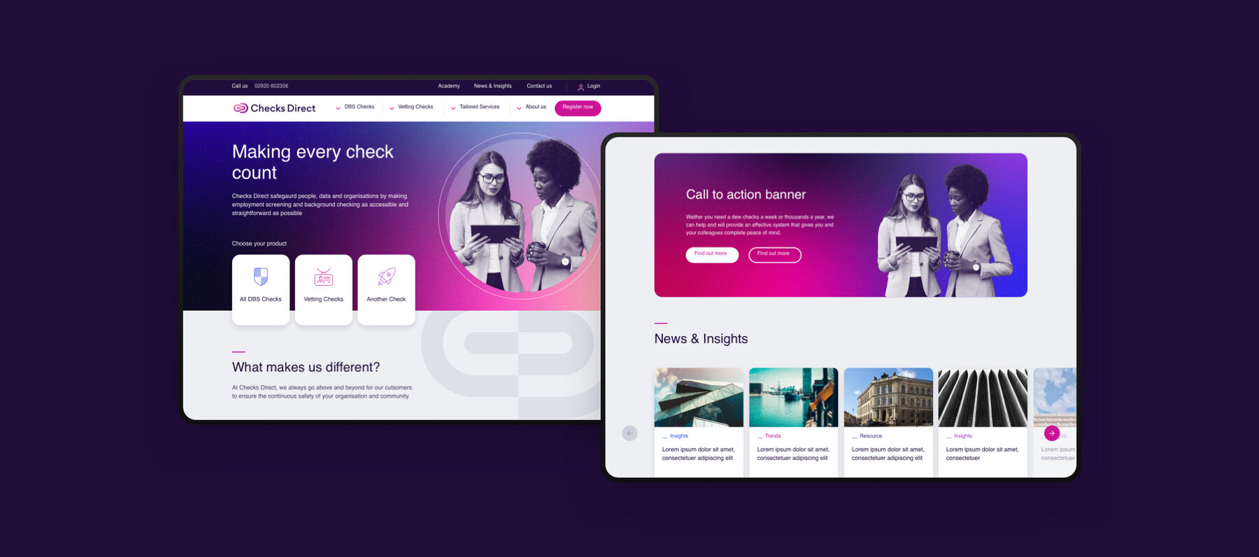
From our discussions, it was clear that developing a compelling and unique go-to-market proposition would help to establish the new brand and help them attract bigger clients. A new website and visuals to coincide with the new position would also help to showcase the company’s new identity and drive growth through digital transformation.


The Solution
We ran a series of workshops with key stakeholders from the Checks Direct to get under the skin of the business and ensure we developed a brand that resonated with their customers. The workshops allowed us to evaluate, review and identify the company’s core values and purpose, so we could create a set of user personas and a brand blueprint that defined their tone of voice, messaging, core purpose and big idea.
We also ran a competitor analysis alongside the workshops to give us a better understanding of Checks Direct’s position in the market and a deeper insight into the industry.
As part of the rebrand, we were tasked with developing with a new name for the business. After a brainstorm and presentation with the team, Checks Direct was chosen for its simplicity. It also clearly covers the wide range of services that the business offers.
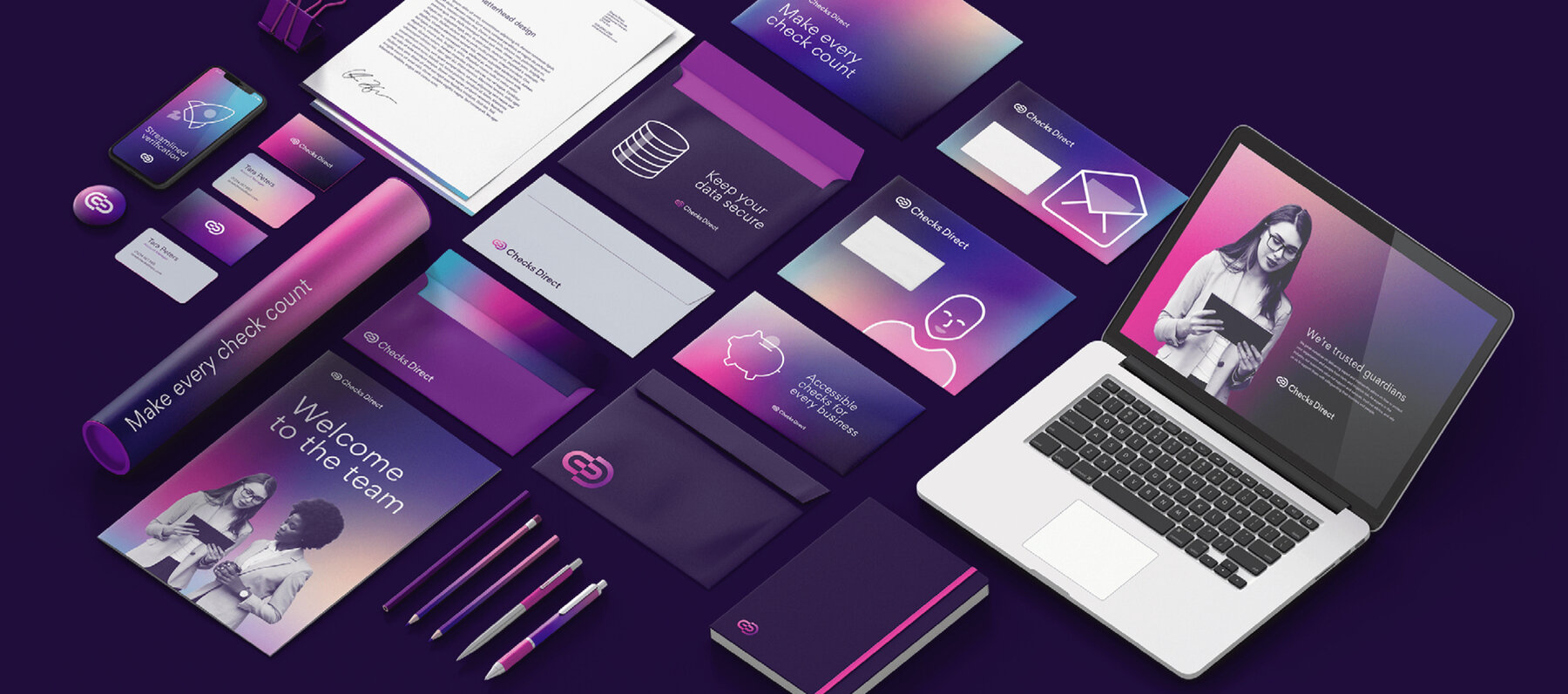
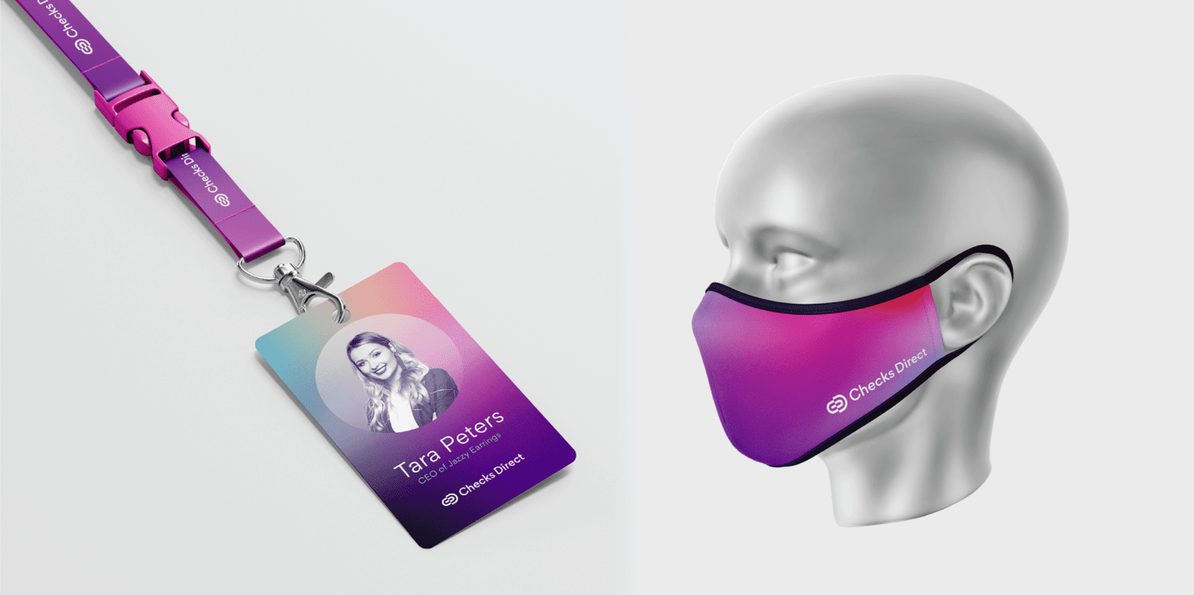
Once a new name was agreed upon and the brand blueprint was agreed, we developed a visual brand that reflected the rename and rebrand. A new logo, website and a collection of marketing assets would also set them apart from the rest of the checks market.
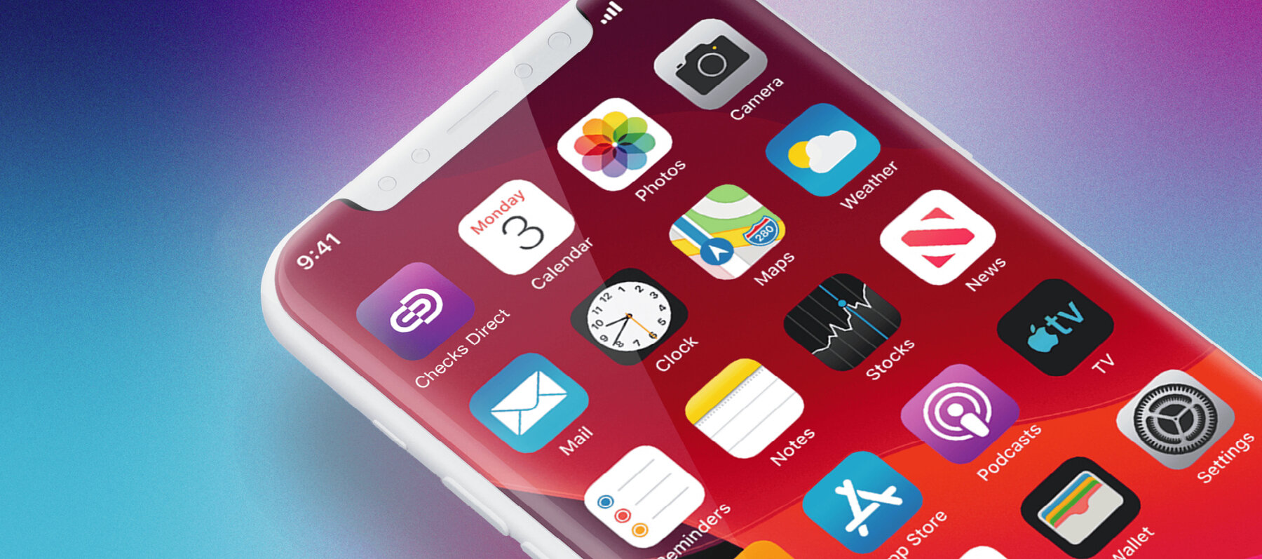
The new logo is an abstract monogram, which connects the C and D to make a padlock. This subtle nod to security instantly makes the brand more modern and provides a visual link to its’ former incarnation. We also introduced a softer colour palette and gradient to humanise the brand and differentiate it from the rest of the market. The gradient adds texture to the branding, making it less corporate, more accessible and human and not sector-specific. Not only does the gradient make the brand more physical in the web space, but we worked hard with the application of colour to ensure it meets double-A accessibility standards, which is the required level of accessibility for many online services.
The Challenge
Working with a company of a similar size to Checks Direct means that there is a broad range of services and audiences across the business. One of the challenges was to ensure that everyone from different departments was singing from the same hymn sheet. As part of the rebranding process, the blueprint enabled us to establish a strong internal brand and give employees a unifying message to get behind.
Not only was the blueprint a key document for moving forward, but it also embedded the company’s proposition and made them think about who they want to be going forward. This enabled us to establish its core purpose ‘making every check count’ and reinforced the human value of each check both internally and externally.
From our competitor analysis for Checks Direct to stand out, its visual identity needed to make the brand unique in the marketplace and resonate with its audiences. The market is full of competitors who use blues and reds in their branding. They also rely on stereotypical corporate photography to represent different the brand. For Checks Direct, the goal was to step away from the expectations set by competitors. By aligning the softer colour palette, with a set of relatable but flexible photography guidelines we created a visual brand that ensure Checks Direct presents a unique alternative to what’s going on in the market.
The Results
The collaborative nature of this brand project speaks volumes in terms of its success. We seamlessly worked with a large team of specialists at Checks Direct team to develop a brand that truly represented the company and its’ ethos. By working with a specialist project manager, UX designer marketing director, sales team, digital transformation consultant, operations director and even the CEO, we were able to get under the skin of the brand and create a brand that would give Checks Direct a strong position in the market and a launchpad for growth.