For the love of branding
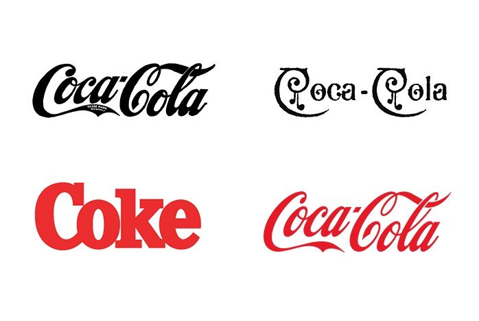
It can be hard to convince someone to change their brand. People believe a logo is permanent, often citing companies like Nike and Coca-Cola as strong examples of branding that have stood the test of time. What if we told you Nike used to be called Blue Ribbon Sports and the beloved cursive text of Coca-Cola has been changed and refined numerous times since its inception?
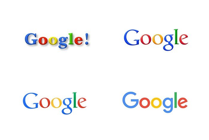
Another relevant example is Google, a company born at the start of the digital age who has made multiple incremental changes to its brand over the years, removing unnecessary ornamentation until it is as clean as possible.
A good brand is malleable and adaptable, as your business grows and changes, the core elements of your brand should change with it. A brand should be treated like any other aspect of your business. It should be reviewed, questioned and picked apart throughout its lifespan. Does it still do its job? Is it still relevant? And most importantly, can it be improved?
Spindogs is a very different business today than we were 7 years ago when we last updated our logo, so we wanted a mark that represents us and the business we are today, not the one we were almost a decade ago.
The good, the bad and the ugly
The first step in refining a logo is deconstructing what it does well, what it does poorly and what should be completely changed. This exercise will give a clear direction on how to improve what exists whilst maintaining the heart of the business.
What are the stand out features?
- Red
- The Spindogs ears
- Lowercase text
The friendly and approachable nature achieved by the old logo is not something to be sniffed at. There is a charm that comes from the lowercase text and bouncy ears that captures the essence of Spindogs. These features are the core ingredients for the Spindogs brand and so we wanted to highlight and preserve these.
What can be improved?
- Text is too close together
- Red is too dark
The red colour used in the old branding was just a touch too dark. We are a digital agency, working in a bright and vibrant community, so our palette should reflect that. The text being squashed together also makes the logo difficult to read at smaller scales.
Nuthin’ but a “G” Thang
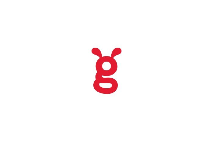
Out of context, the Spindogs ‘G’ is a little confused, without the rest of the letters is it a ‘G’ at all? The ‘G’ with its little pair of ears is the most recognisable element of the logo, the two little appendages atop the consonant are what gives the logo its character, so they had to stay. It was this mandatory that led us to solving the ‘G’ problem. When it comes to letterforms you may have noticed that there are two different styles of lowercase ‘G’, one called a single-story and the other a double story.
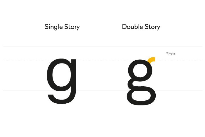
The old logo utilised a heavily modified version of the single-story ‘G’. Now, for the typography aficionados among you, you’ll already be well aware the little bit sticking out at the top of a double-story ‘G’ is actually called an “ear”. By changing to a double-story it not only solves a legibility issue it actually makes more sense! The double story ‘G’ is much more elegant than its predecessor, as the fluid curves surround the letters much more succinctly.
Order in the ranks
Once the ‘G’ had been amended we needed to create some continuity with the other letters. If you look closely at the old Spindogs logo you will notice that there is a lot going on when it comes to letter styles.
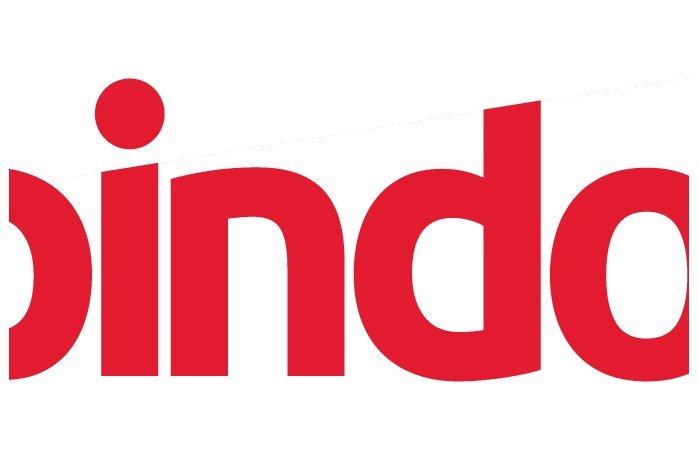
We tried countless typefaces, eventually modifying a combination to produce a mark simple enough to allow the character of the ‘G’ to really shine. The angled letter caps on the text from the old logo are brought more into play giving nice sharpness to the type. The angles on the ‘P’, ‘I’ and ‘D’ are all parallel providing a satisfying uniform to the characters. Each character knits together without touching to give a bouncy feel to the text, without becoming childish. The link and loop tail of the double-story ‘G’ nestle nicely among the other letters and bring a balance to the entire word.
Old dog new tricks
In conclusion, our new logo is friendly, bold and unique and successfully encompasses the culture we’ve worked hard to create at Spindogs. Every element, every curve and corner has been meticulously thought out and we think this is much more in line with who we are today.
We’d love to know what you think! Let us know your feedback or get in touch if now is the right time for you to refresh your brand.